

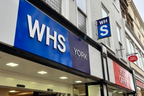
WHSmith has sparked confusion with its new logo as part of a mini-rebrand that is being trialled across the country.
The high street retailer has renamed several of its branches to ‘WHS’, dropping the surname of founder Henry Walton Smith from its branding.
The new logo – the three-letter symbol written out in white font on a blue background – has been introduced to ten of its stores across the UK including in York and Preston.
Subscribe to Retail Gazette for free
Sign up here to get the latest news straight into your inbox each morning
A spokesman for WHSmith told The Telegraph that the new signs were designed to raise awareness of the range of products sold by the company.
Alongside the branding, the new signs also advertise books, stationery, greeting cards, newspapers and “convenience”.
It comes as the retailer is looking to strengthen its high street business as its travel division posted a 36% UK sales growth for the year to August 31.
WHSmith reported a profit before tax of £143m for the year, up 96% from last year. thanks to a 28% surge in group revenue to £1.79bn.
Click here to sign up to Retail Gazette‘s free daily email newsletter


4 Comments. Leave new
All I can see is ‘NHS’. Anyone else underwhelmed?
What a waste of money. Money could have been better spent on investing in certain stores to make them look like the Airport stores.
What a waste of money on a bland rebrand that is unlikely to be followed through.
Designed by someone without a clue, no one calls it WHS they call it “Smiths” so they should have used that brand.