Louise Noble explains why art was the inspiration of Fitflop’s recent collaborations

FitFlop
Feature ArticlesMarketingNews

Fitflop have looked to the art world for their latest collaborations, partnering with artist Keith Haring and colour standards company Pantone.

Louise Noble, FitFlop chief product and brand officer explains that the idea for the Keith Haring campaign came from movement. The brand wants to help people move better and Haring’s work “is full of movement, optimism and energy”.

She says: “The partnership felt incredibly natural It gave us the opportunity to tell that story through a completely different creative lens.”

She adds that they felt like the partnership was the right move because Haring believed art should be part of everyday life, “not something reserved for galleries”.

Noble comments: “That philosophy resonated with us because we’ve always believed good design should improve everyday life too. It wasn’t about putting artwork onto a shoe. It was about creating product that feels joyful, expressive and genuinely desirable.”

According to Noble, the concept for the campaign was already present in Keith Haring’s work as his figures communicate “rhythm and movement”.

She says: “We wanted the shoe to become part of that story rather than simply carry the artwork. Every graphic placement was considered around how the product moves with the wearer, creating something that feels dynamic rather than decorative. Haring had already done the hard work. We just had to respect it.”

She explains that innovation has always been part of FitFlop’s DNA.

She says: “What is evolving is how we express ourselves. For years we’ve been known for what our products do. The opportunity now is to become just as well known for how they make people feel.


“The strongest brands balance innovation with emotion. Partnerships like these are designed to surprise people, create new conversations and bring new audiences into the brand. We hope they leave consumers wondering what comes next. Innovation gives you credibility. Creativity gives people a reason to fall in love with your products. The most exciting brands are built when the two come together.”

She explains that she hopes this collaboration allows audiences to see the brand through “fresh eyes”. Fitflop’s heritage is important to them but brands must constantly evolve with the times. She believes that FitFlop will be “more expressive, more creative and more confident” about how it comes across.

She says: “These partnerships are about opening new doors for the brand while staying true to what existing customers already love. If people think, “I didn’t know FitFlop did things like this,” that’s probably a good sign.

“The best partnerships raise eyebrows. They challenge perceptions and get people talking. This one did exactly that. Hopefully it leaves people wondering what we’ll do next.”

According to Noble, digital is important to the firm as it allows them to bring the energy and personality behind the collection to life “in a much richer way”.

She says: “Honestly? I just hope people want the shoes.”

“Of course we want people to appreciate the collaboration, but the real measure of success is creating product that people instantly connect with. If we’ve made people smile, challenged a few assumptions and left them curious about what’s coming next, then we’ve done our job.”

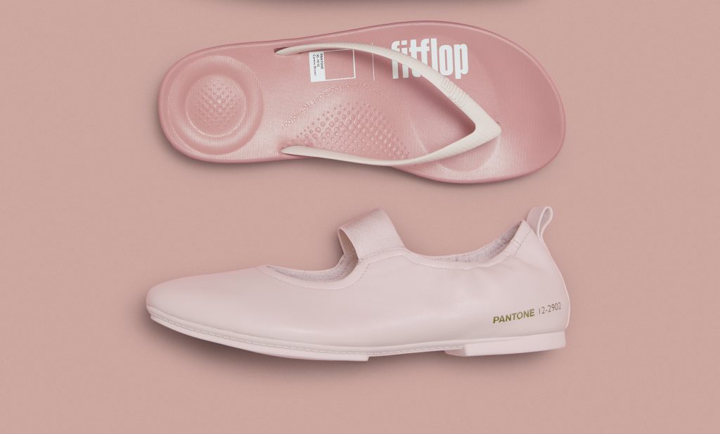
Fitflop has had a very busy few months, also partnering with Pantone for a new collaboration. The Pantone campaign is “quieter, softer and more understated”. But both campaigns are “very creative ideas”.

She says: “They show the breadth of our brand. One explores movement through art. The other explores emotion through colour.”

“Pantone gave us a completely different creative conversation. Everyone knows Pantone because colour matters. What interested us wasn’t colour trends, it was colour’s emotional impact. How it can change the way you feel before you’ve even taken a step. It was another opportunity to look at innovation through a different lens.”

She explains that colour was important for the campaign as it directed the “storytelling”.  It uses a soft palette of greens, muted pinks and warm neutrals and aims to feel “calm and quietly confident”. Nobel highlights that “sometimes the most powerful colours don’t shout”.

She says: “The Pantone collection explores quieter moments with a softer palette inspired by the feeling of a hazy summer afternoon. Everything, from the product and styling to the photography was designed to create that same feeling of ease. It’s a quieter approach, but no less expressive.”

Fitflop developed the concept for its Pantone campaign by leaning on a feeling rather than a visual. It wanted to recreate “hazy summer moments”, where “everything feels a little slower, lighter and more relaxed”.

Click here to sign up to Retail Gazette‘s free daily email newsletter

Feature ArticlesMarketingNews

Leave a Reply

Your email address will not be published. Required fields are marked *

Fill out this field
Fill out this field
Please enter a valid email address.

Louise Noble explains why art was the inspiration of Fitflop’s recent collaborations

FitFlop

Fitflop have looked to the art world for their latest collaborations, partnering with artist Keith Haring and colour standards company Pantone.

Louise Noble, FitFlop chief product and brand officer explains that the idea for the Keith Haring campaign came from movement. The brand wants to help people move better and Haring’s work “is full of movement, optimism and energy”.

She says: “The partnership felt incredibly natural It gave us the opportunity to tell that story through a completely different creative lens.”

She adds that they felt like the partnership was the right move because Haring believed art should be part of everyday life, “not something reserved for galleries”.

Noble comments: “That philosophy resonated with us because we’ve always believed good design should improve everyday life too. It wasn’t about putting artwork onto a shoe. It was about creating product that feels joyful, expressive and genuinely desirable.”

According to Noble, the concept for the campaign was already present in Keith Haring’s work as his figures communicate “rhythm and movement”.

She says: “We wanted the shoe to become part of that story rather than simply carry the artwork. Every graphic placement was considered around how the product moves with the wearer, creating something that feels dynamic rather than decorative. Haring had already done the hard work. We just had to respect it.”

She explains that innovation has always been part of FitFlop’s DNA.

She says: “What is evolving is how we express ourselves. For years we’ve been known for what our products do. The opportunity now is to become just as well known for how they make people feel.


“The strongest brands balance innovation with emotion. Partnerships like these are designed to surprise people, create new conversations and bring new audiences into the brand. We hope they leave consumers wondering what comes next. Innovation gives you credibility. Creativity gives people a reason to fall in love with your products. The most exciting brands are built when the two come together.”

She explains that she hopes this collaboration allows audiences to see the brand through “fresh eyes”. Fitflop’s heritage is important to them but brands must constantly evolve with the times. She believes that FitFlop will be “more expressive, more creative and more confident” about how it comes across.

She says: “These partnerships are about opening new doors for the brand while staying true to what existing customers already love. If people think, “I didn’t know FitFlop did things like this,” that’s probably a good sign.

“The best partnerships raise eyebrows. They challenge perceptions and get people talking. This one did exactly that. Hopefully it leaves people wondering what we’ll do next.”

According to Noble, digital is important to the firm as it allows them to bring the energy and personality behind the collection to life “in a much richer way”.

She says: “Honestly? I just hope people want the shoes.”

“Of course we want people to appreciate the collaboration, but the real measure of success is creating product that people instantly connect with. If we’ve made people smile, challenged a few assumptions and left them curious about what’s coming next, then we’ve done our job.”

Fitflop has had a very busy few months, also partnering with Pantone for a new collaboration. The Pantone campaign is “quieter, softer and more understated”. But both campaigns are “very creative ideas”.

She says: “They show the breadth of our brand. One explores movement through art. The other explores emotion through colour.”

“Pantone gave us a completely different creative conversation. Everyone knows Pantone because colour matters. What interested us wasn’t colour trends, it was colour’s emotional impact. How it can change the way you feel before you’ve even taken a step. It was another opportunity to look at innovation through a different lens.”

She explains that colour was important for the campaign as it directed the “storytelling”.  It uses a soft palette of greens, muted pinks and warm neutrals and aims to feel “calm and quietly confident”. Nobel highlights that “sometimes the most powerful colours don’t shout”.

She says: “The Pantone collection explores quieter moments with a softer palette inspired by the feeling of a hazy summer afternoon. Everything, from the product and styling to the photography was designed to create that same feeling of ease. It’s a quieter approach, but no less expressive.”

Fitflop developed the concept for its Pantone campaign by leaning on a feeling rather than a visual. It wanted to recreate “hazy summer moments”, where “everything feels a little slower, lighter and more relaxed”.

Click here to sign up to Retail Gazette‘s free daily email newsletter

Social


SUBSCRIBE TO OUR DAILY NEWSLETTER

  • This field is for validation purposes and should be left unchanged.
Feature ArticlesMarketingNews

Leave a Reply

Your email address will not be published. Required fields are marked *

Fill out this field
Fill out this field
Please enter a valid email address.

RELATED STORIES

Latest Feature


Menu

The brand, budget, and agency decisions reshaping UK retail marketing

Join 1.5k retail marketing directors and senior leaders

Marketing Weekly NL Form

  • This field is for validation purposes and should be left unchanged.


Close popup

Please enter the verification code sent to your email: