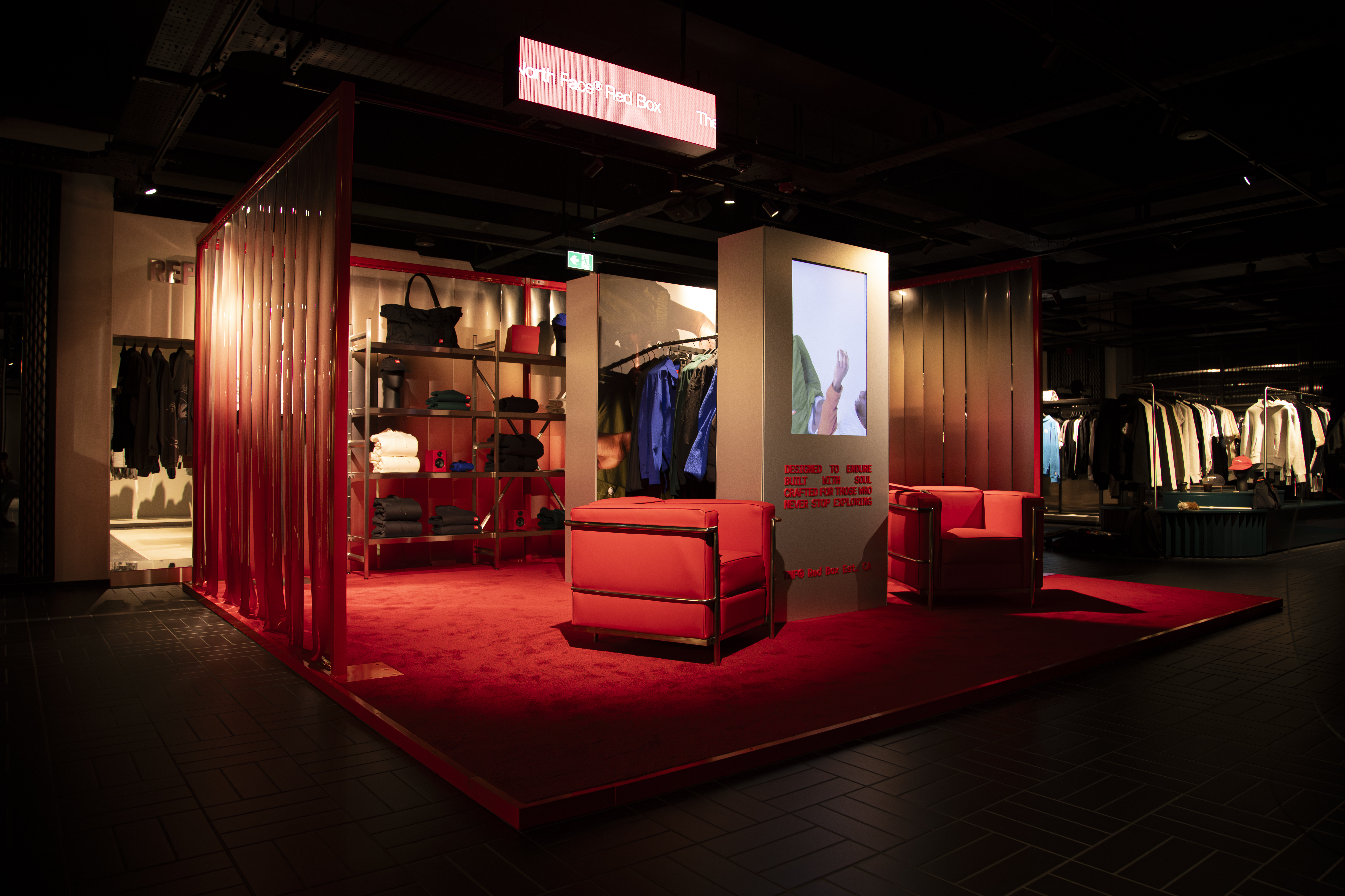
American clothing brand The North Face has unveiled a new concept space within Flannels to mark the launch of its SS26 Red Box Collection.
The new design can be found in Flannel’s flagship stores in Leeds and Liverpool and aims to bring “elevated in-store theatre” to the retail experience.
Devised by creative agency Syn, the pop-up was designed to respond to a generation of luxury customers who move between “technical performance and lifestyle expression”.
The space has been curated to look like a literal ‘red box’ within the store. It features a red carpet and custom-printed PVC curtains.
Alongside the pop-up, The North Face hosted a series of physical and digital activities across London. The brand also partnered with DJ AG, who does DJ sets in the street, and Royal Khanna, a British rapper, for a surprise set in-store.
I sat down with Syn’s senior creative Jack Cox, to find out how the team came up with the design.
He explains that they came up with the design in two parts- the technical aspect and the concept.
Cox says: “Conceptually, we wanted to mirror the playfulness of the campaign.”
He adds: “We did it through like balancing sight lines a little bit, blocking them in some areas, but then allowing them in other areas. So, for example, the gradient on the PVC curtain that was tailored so you could let light through at the top, but still have enough.”
“So there’s some intentional technical details to the build that reference the performance product, but that’s really not the focus. The focus really is more materiality because that leans more towards what you would traditionally see in more luxurious spaces.”
He explains that they combined luxury with The North Face’s outdoor heritage, and the design felt quite challenging, but “more importantly, also felt like something fresh, something new”.
He says: “I think Flannels kind of celebrates being bold in a way, and I think that really gave us the chance to be bold as well.”
Cox pointed out that the menswear floor comprised of cooler colours such as blues, greens and greys, which gave them the space to stand out with red.
He comments: “Each brand within Flannels has its very clear, defined area and its look and feel. So that, combined with the fact that we wanted to stand out and also the fit and finish of everything, added to the premiumness of everything as a whole.”

Related Story

And while it wasn’t part of their brief, Cox highlights that Instagrammability or sharability was important to them when creating the space.
He says: “We actually joked internally while we were creating it that we’re not creating a photo opportunity, but we’re creating a space to share that needs to be shared.”
“I think when you’re overt about like, oh, let’s create a photo opportunity, it often can feel a bit false, but we wanted to just naturally create a space that hopefully people who want to take photos in.”
It was also important to the team at Syn to balance aesthetic with shopability.
Cox explains: “Shoppable products were a key part of our brief. So when we started [the project], we started with the central totems to hero the key product that needed to be shopped.”
“So the functionality of those allowed us to show products, integrate screens for digital content, and then also display large-scale campaign imagery on the inside.”
He says: “Those totems specifically were intentionally oversized to block the sight lines and to encourage consumers to go in and explore more products on and the props on the shelves to the rear.
“And because the elevators were at the front as you approached it, the front of the totem was designed to be purposely oversized to disguise what was behind it.”
He comments: “So you have to go to the side. And I think the balance came through with the materials that brought it all together, so the varied mix of the reds and the seals brought it all together, allowing the intentional obstruction to not feel too overbearing because the palette of materials blended everything together.
Speaking about premium retail marketing more broadly, Cox says: “I would say it comes more down to conviction of a concept. I think conviction is needed to get people’s attention these days. And I think premium brands do this in the best way by picking one idea, however simple or arbitrary, and then just running with it.”
“I think combined with fewer products in a premium space, the clarity of the idea or the concept seems to feel more powerful and more impactful to me.”

Click here to sign up to Retail Gazette‘s free daily email newsletter